


UMBC Bookstore Case Study
Role: Sole Product Designer (User Research, UX/UI Design, Interaction Design, User Testing)
Duration: 8 weeks
Team: Individual
The Challenge
It was very clear early on that the bookstore website's biggest pain point is it's visibility and affordance issues. The main landing page consisted of big image blocks that serve as buttons/hyperlinks to other pages though at first glance you won't be able to tell that they are interactive. Then there is a functional issue with it's constraints, as the bookstore website makes it unnecessarily harder for a student to get anything done on the website. For example, to start using the website for merchandise and books you have to create a separate account which is not your myUMBC account but to contact the bookstore team from the website you have to use your myUMBC account

The Solution
I plan to redesign the website by addressing the aforementioned issues. For example, the landing page will be redesigned to showcase limited information about the bookstore and only a few featured items for sale as to not overwhelmed the user. Whereas, the top navigation bar shall do the job of directing the user to their destination. Additionally, myUMBC account will be integrated with the bookstore so that a student can log in and their class data would be pulled to show them a personalized version of recommended course materials instead of them having to search it all themselves. Overall, I look forward to analyze data from the survey, natural observations and past experience/intuition to come up with a solution that is easier to use, calmer on the eyes and less straining on the brains
Use Case
Goal: Find required textbooks for the semester.
Normal Course
User arrives on the landing page: bookstore.umbc.edu
User takes in all the information and decides to hover over 'Course Materials' in navigation bar.
System displays a drop down menu with relevant options like 'Textbook List', 'CMI', 'Buying', 'Renting', 'eBooks'.
User clicks on 'Textbook List'.
System displays a database query form where user can enter semester, department and class info.
User enters the relevant class details and clicks 'Next'.
System displays the required textbook for the said class along with a thumbnail, medium option (i.e. Hardcover, eBook etc) and an 'Add to Cart' button.
User selects their desired option and adds the book to their cart.
The system confirms that the book is added to the cart.
Goal: Contact bookstore staff for help with their order.
Normal Course
User arrives on the landing page: bookstore.umbc.edu
User clicks the 'Contact' button in navigation bar.
The system opens to a user form with Name, Reason for Contact, Order No. (optional), Message.
User fills out the relevant info along with their order number and clicks submit message.
The system displays a confirmation message "Your message has been sent. Bookstore staff will reply to your message within 1-2 business days".
Alternative Course
User clicks on 'Contact' button in navigation bar.
System displays a "log into myUMBC to complete this form" error message.
User logs into myUMBC account.
The system opens to a user form with Name, Reason for Contact, Order No. (optional), Message.
The Scenario
Farah Shah, a 22-year old rising senior has just registered for her Spring 2021 semester after a quick jog to her room so as to not miss the registration deadline. She opened her laptop and looked ecstatic because this was her last semester of undergrad and she had the chance to take fun/interesting electives as she was done with her major requirements.
Overjoyed after registering for classes with her favorite professors she decided it was time for her to look for the course materials and textbooks to be proactive about the upcoming semester. She logged onto the bookstore website and clicked on Course Materials button. She then selected Textbook List from the drop down menu and was presented with a form to fill with information regarding her classes such as Semester, Department and Class/Professor. Farah found this process to be tedious and frustrating as this should have been something that gets auto-filled from her myUMBC account. However, after entering this information, she got a list of all the books she needed for spring semester.
She then added all the books to her cart and took a sigh of relief knowing that all was said and done in a timely manner and that she'll never have to use the bookstore website again.
User Personas


Heuristics Evaluations
User Interviews
User 01: Current User of UMBC's site
This interview was conducted virtually due to the ongoing pandemic and was scheduled to be 15 minutes long. The interview was done to get a brief understanding of what the user's experience was using the UMBC bookstore site, what the highs and lows of the entire products are from their perspective. I had asked the user to explore the website a bit ahead of the interview to save some time on their part. I had prepared a few questions to ask the user such as "If you had to get rid of one page, feature or function off the site, which one would it be and why?" to which the user responded "check out experience". They further explained in detail saying that the checkout process is cumbersome because the user has to manually enter every little detail for their respective classes (i.e. course number, time, professor etc) to find the book that they require for their class and the checkout does not provide the option to use UMBC card to pay for the books.
Additionally, they expressed their frustration with general navigation of the site because "it all seems too confusing". They mentioned that the homepage was too confusing the first few times they used it as it was unclear what exactly was interactive and what wasnt. I asked the interviewee to complete a bunch of tasks that entailed interaction with the interface and asked them to verbalize any issues or frustrations they come across. I wanted to see how a seasoned user of a site goes about using the features that they might not interact with on a day to day usage. In this case, the interviewee had a hard time using contact form/ help desk and the consumer end of the site because they had only adapted to using the books and students end of the site.
This matched my initial notes from the Heuristics Evaluations so I shared this with my interviewee and they agreed with all of the other issues that I had pointed out. They mentioned that the site not only has obvious visibility issues but also an onslaught of functionality and usability issues.
User 02: Current User of Competitor's Site
This interview was conducted virtually due to the ongoing pandemic and was allotted 45 minutes. The interviewee was a current student at a competitor university of UMBC who had experience using the bookstore for their school so their expectations of what a bookstore should be like and how it should function were based on that experience and it was very helpful in gauging where UMBC stands as far as industry standards goes.
I gave the interviewee around 15 minutes of our time to go through the site on their own and explore the site. Later on I asked them about their initial thoughts and they mentioned that the site felt "confusing and was tough to look at" they mentioned that the sight was a visual horror because there was a lot going on and most of it did not make any sense as to why it was on the site in the first place. "For example, why was YUM SHOPPE on the site?"
Thereafter, I asked them to perform a few tasks using the think-aloud process and during that task the user was verbally and emotionally frustrated at how long the process of finding a certain merchandise took. Not only that the user noted that the images for the products were generic and did not reflect the product listed. The images aspect ratio was inconsistent and the color selection option was a checkbox that listed out every color option instead of showing what a specific product would look like.
I shared with them my findings from HE and UAR and they agreed that the site was infested with consistency, usability and visibility issues and it'd be better to re-do the whole site instead of making incremental changes to the current one.
Low Fidelity Mockups
The Landing Page:
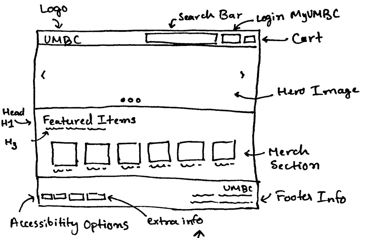
One issue that I repeatedly heard from everyone I spoke to throughout the process was the fact that the landing page for the site was too crowded and full of useless information that made it impossible for anyone to figure out their next possible click/step. One way I proposed of solving this was by removing all of the redundant buttons/images and replaced it with a hero image that spanned 1/3rd of the screen and then have the next section of the page peeking out from the bottom of the page so as to avoid the false-bottom phenomenon. I plan to use that section for all the featured merchandise that the bookstore has in stock to promote sales and make it easier for new visitors/guests to find memorabilia easier.
Quite a few students had mentioned their qualms with the bookstore website stating how annoying it is to have an entirely separate login for the bookstore that does not subside with the existing myUMBC login. Additionally, with the amount of redundant buttons on the navigation bar and all of landing page, the student's would often end up on the wrong page (i.e. accidentally ending up on CMI page which does not have any textbook listings but rather just information on what the program offers). I solved this by make a separate FAQ page listed in the footer of the site for all the informational content and leave the navigation bar simple and to-the point.
My Account Page:
This page/feature is a massive usability issue. However, I addressed this issue by designing a one-form fits all solution. A guest can use the same login page and use their commercial email while students can just as easily type in their UMBC login and still be able to log in as if it were any other UMBC website. Creating a SSO (single-sign on) option for ease of use.
In addition to this, the page will also serve as a one-stop shop for all the students to find their required textbooks without having to type out and search for their books one by one. Considering that we are using the myUMBC account it'd make things easier to pull student's registration info and suggest their course materials offering a quick checkout option.
There is a lot that can be changed about the UMBC bookstore website and new features can be added but for the benefit of keeping things design focused, the aforementioned are my suggestions to address any and all visual and usability issues that I came across during my research.


High Fidelity Mockups

The original homepage was a cluttered mess with faux buttons, feedback, and other visibility issues. The new homepage address that issue by making sure that all the navigational information that a user might need is available right at the top. In addition, I have added a search bar that the current site is missing to make it easier for students or visitors to get to their desired destination. From my interviews and surveys a lot of guest visitors had mentioned how the merchandising options are hidden deep in the maze of a site which deters users from buying from the bookstore so I added the featured items section on the homepage itself to address that issue. Overall, the redesigned homepage is a complete overhaul aimed to revamp the brand and functionality of the UMBC bookstore


Login
The Login page on the current site offers a singular logon option that both the students and guests have to use and while it may sound better in theory, it hinder's usability and operational efficiency for both students and visitors. The new site's proposed log-in page lets UMBC student use their existing SSO (Single Sign On) option to further integrate the systems and provide a seamless experience. Guests can checkout without having to make an account but have an option to make an account using their third-party email as well.
Checkout Process
One of the things that student user's from surveys had mentioned was how difficult the process of finding their required books and checkout process is. This redesign leverages the myUMBC login integration to provide a one click option and the website automatically finds the relevant books based on your registered classes. Students can easily use the checkbox on the left to added books to their cart which is shown in real time and they can checkout from the same page cutting down the existing 6 page process to just one.


